Making-of · 11 min read
Created with Claude
How this portfolio was built in tandem with an AI — and where I took back the reins
This site is my first AI project. Not a stock-generated demo: a real exercise in art direction, where I briefed Claude Code, validated, course-corrected, and coded myself whenever it was time to take back the reins.
01 Why tell this story
Direct the AI, don't just use it
Because today, “I used an AI” has no value left. Everyone did. What sets apart is knowing how to direct it — choosing what to delegate, what to keep in hand, when to course-correct, when to let it run.
This portfolio is my first project built with Claude Code as a partner. The machine wrote code, I made all the decisions. At the end, the site is entirely in my image — because I held the art direction, line by line. AI didn’t replace a designer. It replaced the waiting we usually have between intention and execution.
I don’t design interfaces with AI. I design with AI complete brand experiences — and I only ask the AI what I know how to judge.
02 The method
It all fits in three files
No complex agents, no RAG, no obscure pipeline. A human who knows what they want, an AI who knows how to write it fast.
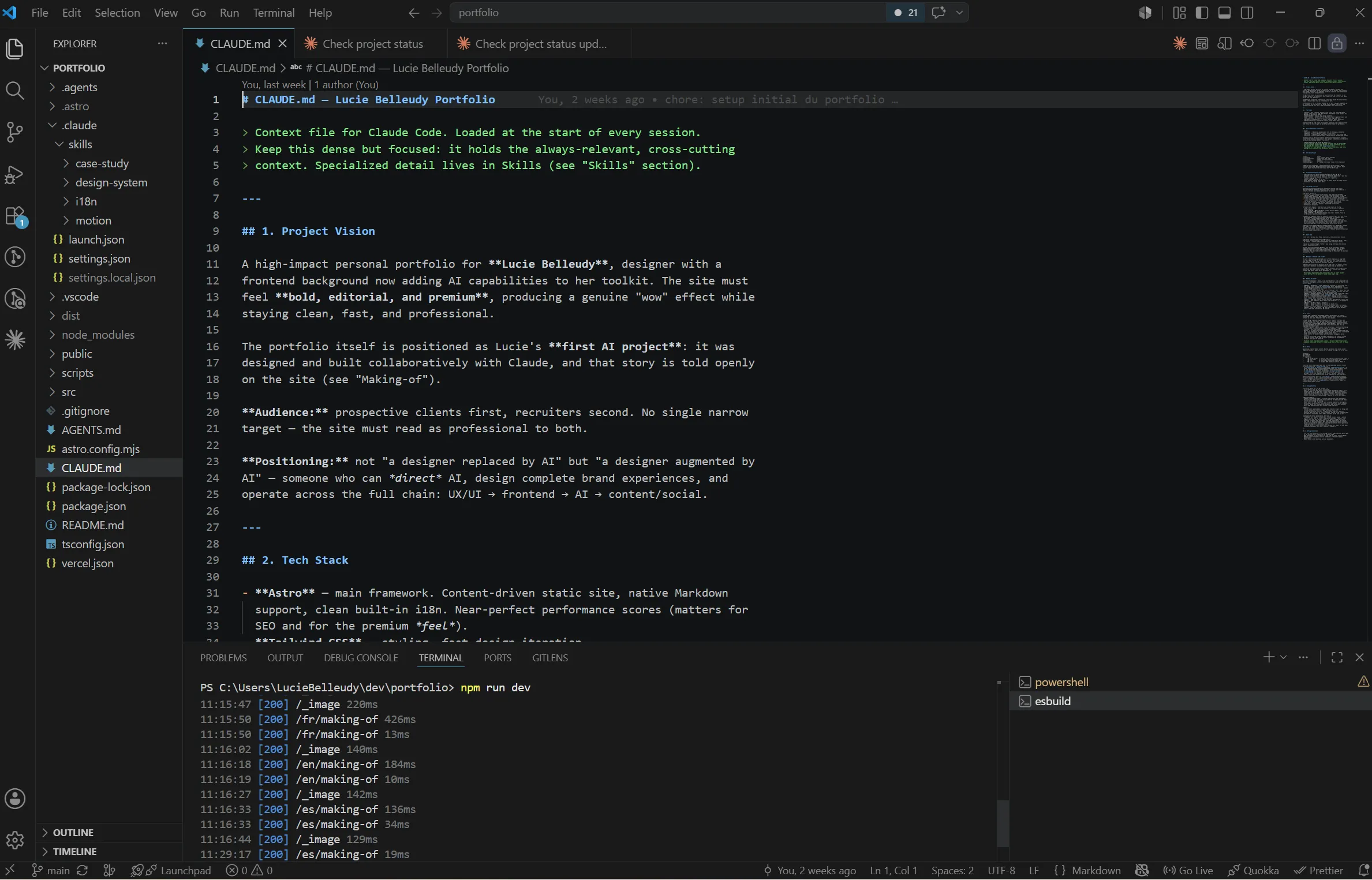
1. CLAUDE.md at the root. A long dense note — vision, stack, identity, architecture, phases, conventions. It’s what Claude Code reads first on every session. Without it, it invents. With it, it knows what it’s dealing with.
2. Custom skills in .claude/skills/ — design-system, i18n, case-study, motion. A skill is a precise document about one thing. Claude Code only loads it when needed (e.g. the motion skill loads when I touch GSAP). Prevents saturating its memory with everything at once.
3. The Git repo itself. Each phase of the roadmap = a commit validated by me. If something goes wrong, I know exactly where to roll back.
03 The build
Phase by phase
Seven phases, each a validated commit. The site deployed live from phase 1 onwards.
00 Phase 0
The vision and design system
Before a single line of code, two hours of strategic brainstorming with Claude. Not to let it decide — to structure what I had in mind. Audience, tone, positioning, constraints. By the end, we had CLAUDE.md.
Then the design system: black / white / yellow palette, Anton + Inter + Fraunces, a spacing scale, motion rules. Transposed from my old Wix site, but affirmed — no more template constraints.
Where I took back the reins: the palette. Claude Code was suggesting something more “tech start-up”. The signature yellow is mine. A designer’s intuition that no AI can guess from a description.
01 Phase 1
The technical setup
Astro 6 (static, performant, Markdown-friendly), Tailwind 4, GSAP + Lenis, Vercel. In one session, the site was online with a live URL — empty but deployed. Seeing the evolution online on each commit was a huge motivation lever.
What stood out: the moment Claude Code wrote astro.config.mjs with i18n configured for FR/EN/ES in one shot, without me having to dig through docs. That’s the real gain — not creativity, the absence of technical friction.
02 Phase 2
Content architecture
Zod schemas for case studies, per-language subfolder for multi-doc collections, flat file for single-docs (about, making-of). Creation of the case-study and i18n skills.
Where I stepped in: Claude Code wanted one collection per language (case-studies-fr, case-studies-en…). Simpler to code for it, but it would have duplicated the schema three times. I imposed a single collection with a subfolder per language. The consequence is visible now: adding a new language takes five minutes.
03 Phase 3
Components & motion system
Nav, Footer, LangSwitcher, ProjectCard, Reveal, SmoothScroll (Lenis). Creation of the motion skill. That’s where the shell started to come alive — entry animations, hover that lights up in yellow, smooth scroll.
Key decision: animate the hero in pure CSS, not GSAP. No bundle JS dependency for LCP. A web developer’s intuition, defended against the suggestion “GSAP everywhere”.
04 Phase 4
The home page
Final hero, “Selected work” grid that finally consumes the Astro collection, About section in preview, monumental contact CTA.
Assumed bet: publishing four published case study stubs rather than waiting for real content. Better to show the machine working on readable stubs than have an empty grid. The final content will land on top, without touching the structure.
05 Phase 5
The project pages
Index /work as editorial list (Fraunces number + Anton XXL title + meta), with a thumbnail that follows the cursor on hover (Awwwards effect, GSAP quickTo, lazy import). Dynamic page /work/[slug] for each project: full-bleed hero, structured meta block, Markdown body rendered in editorial .prose style, cyclic NextProject.
The moment of pride: the first time I hovered an item in the index and watched the thumbnail float softly toward the cursor. 70 lines of code for something that, on Awwwards, is the signature effect of many award-winning portfolios.
06 Phase 6
About & Contact
Narrative pages. The About page tells a real trajectory — not a list of skills. Hospitality left without a plan B. Design discovered by chance through WordPress and affiliate marketing. A master’s in web development to formalize what had been learned alone. Versatility as the result of a series of unplanned choices, not a positioning. Contact page with no form — just a huge email and a direct line.
A personal portfolio doesn’t need a Hubspot form.
04 Honesty
When Claude Code is good. When it isn't.
Good for
- Technical setup — configs, dependencies, Astro/Tailwind/GSAP conventions.
- Boilerplate — 12 multilingual page stubs in 2 minutes.
- Types & Zod schemas — never a TypeScript syntax error.
- Known patterns — Lenis smooth scroll, ScrollTrigger, image optim.
- Documentary writing — skills, READMEs, commit messages.
- Coherent multi-file refactor.
- Visual exploration (Claude Design) — layout directions, palette, components — before committing to code.
Not good for
- Design decisions — palette, type, ratio, visual rhythm.
- Non-standard architectural choices — my file conventions.
- Editorial voice — tone, choice of words, what to keep silent.
- Sensing when “it feels right” without being told why.
- Knowing my craft better than I do.
The day it got it wrong
One morning, I ask it for a status report on the project from a routine’s logs. It hands me a perfectly confident checklist: Git remote missing, zero secured links, case studies still placeholders. All false — it had read a truncated file and filled the gaps on its own, without saying so.
What matters is what came next. I ask it to verify for real. It reopens the files, measures, and rewrites its own checklist flagging its mistakes: remote OK, links already secured, content real and complete.
This is exactly what working with an AI is. It never tires, but it never doubts enough — my job is to doubt in its place. An AI you verify stays an accelerator. An AI you take at its word becomes a risk.

Produce, without delegating judgment
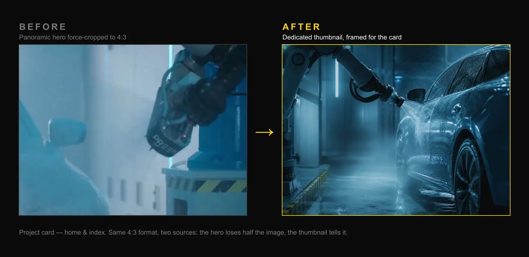
Latest example: the project thumbnails on the home page. The images were there, but badly framed — panoramic banners forced into an almost-square crop. I directed the AI to generate new ones, but I’m the one who decided the framing: rejected a vertical photo that would have cut off the yoga pose, imposed a landscape format, validated each crop one by one.
Same reflex on integration. A file named “documentary” actually contained a content-strategy board. Rather than dropping it under the wrong caption, Claude Code read the image’s content and asked me to decide. A filename isn’t proof — directing the AI also means teaching it what to be wary of.
Three details that needed *seeing*
The hero went through three rounds this week — a scrolling marquee of keywords, a signature underline beneath my name, graphic corner marks like a photo studio’s viewfinder. Three additions in pure CSS, animated in sequence. On paper, done.
Except. The marquee looped with a visible gap on wide screens — the translateX(-50%) technique requires each half of the track to exceed the viewport’s width, and on a 27-inch monitor, five keywords weren’t enough. The underline beneath “Belleudy” was drawn at an approximate width — visually almost right, but not quite. And shrinking the browser window down to tablet size on a desktop (with a mouse, therefore) made the cursor vanish entirely — the native one hidden, the custom one hidden too, nothing left on screen.
I caught all three of these myself — a screenshot for the first, an eyeballed comparison for the second, a plain window-resize test for the third. Claude Code had spotted none of them: the code “worked,” in the sense that nothing crashed. Directing the AI here mostly meant testing like a user, not like a linter.
The fixes tell the story of the gap between “it looks fine” and “it’s actually right.” For the marquee: repeat the keyword list until it comfortably overflows the viewport. For the underline: a ResizeObserver that measures “Belleudy“‘s real DOM width and feeds it back to the SVG — it now matches pixel-for-pixel, regardless of language or screen size. For the cursor: a plain mismatch between the script’s media query (which decides whether to mount the custom cursor) and the CSS one (which decides whether to show it) — fixed by aligning both on the same condition.
None of these three bugs was “big.” That’s exactly why they matter: they’re the kind of detail a visitor never consciously notices, but which, added up, separate a site that works from one that earns trust.
05 Three prompts
That changed something
We don’t use Tailwind Typography for .prose. I want every detail to be design-system — yellow bar before h2s, italic Fraunces numbers for ol, blockquote with caps label.
Result: an editorial style that doesn’t exist anywhere else on the web. Tailwind Typography is too generic for this project.
The hero must be animated in pure CSS, not GSAP. Why: the LCP.
One sentence, one founded technical decision. Claude Code immediately rewrote the hero with @keyframes and a prefers-reduced-motion fallback.
I want the case study cards on the home to be visible right now, even if the real content comes later. Create 3 published stubs, with distinct SVG placeholders in design-system style.
Result: a site that shows from push, not a site that waits for content. A product decision I owned alone.
06 Learnings
Four maxims from the worksite
Directing the AI is directing yourself. The clearer the brief, the more accurate the result. When I fumble, Claude Code fumbles. When I know, it ships.
The designer isn’t replaced. The friction is. The time I gain is the time I used to spend waiting, translating, explaining. Not the time of conception.
Skills are a form of design. Encoding my conventions in .claude/skills/ means inscribing my method into the project. Tomorrow, if someone picks up the repo, they’ll have my way of thinking at hand.
CLAUDE.md is the most important object in the project. More important than the package.json. Without it, every session would restart from zero.
07 Real worksite
Not 5 minutes
AI erased the technical friction. It didn't replace the time to think.
A site generated in 5 minutes exists. A calibrated site takes longer — and that’s not AI’s fault.
This portfolio: 9 phases, several weeks worked alongside other projects. Dozens of sessions, each commit validated by hand. Decisions made, questioned, sometimes reversed. The design system refined until the yellow was this yellow. The animations tuned until they stopped being visible — in the sense that they do their job without being noticed.
What took time is what AI can’t do for me: decide. Knowing when “it works” and “it’ll do” aren’t the same thing. Exigence can’t be delegated.
08 For you
Designers, recruiters, clients
If you're a designer
It’s not a replacement, it’s an amplifier. It doesn’t make you a better designer. It makes you a designer who ships more, faster, without compromising on quality — provided you know exactly what you want.
If you're a recruiter
This site is a real deliverable: deployed, multilingual (FR/EN/ES), animated, accessible, performant. Built part-time in a few weeks. First AI project.
What this demonstrates in practice: the ability to make architectural decisions (not just execute instructions), to catch what AI misses, and to hold a coherent art direction from the first intention to the final render. This page itself — written and structured as a case study — is part of the deliverable.
If you're a client
AI changed my execution speed. It didn’t change how I think through a project.
The brief, the strategy, the visual identity, the structural decisions — all of that stays human. What AI replaces is the time between intention and code. What it doesn’t replace: knowing which code to write.
If someone offers you a complete site in 5 minutes with AI: ask how they chose the color. And why that color will resonate with your audience.
The second will be different. But this one will always have been the first.
Let’s work together
The next project might be yours.
luciebelleudy@outlook.com