2025–2026 UX/UI · Dev
Car Washing
Designing the complete software ecosystem of an AI-driven robotic car wash — a commercial site and three applications.
Translating breakthrough technology (AI + robotics) into a seamlessly integrated software ecosystem — a site that sells, three apps that pilot.
01 The context
An invisible technology to make desirable
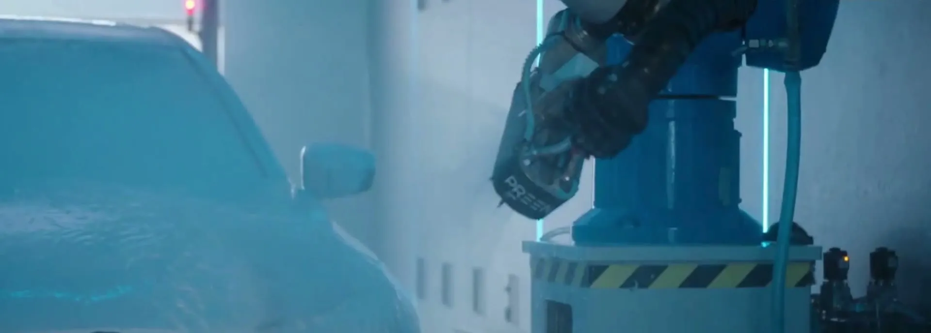
Imagine a car wash without rollers, without contact, where AI-driven robotic arms hug the contours of each vehicle to the millimeter. This isn’t science fiction — it’s the product of a Swiss startup specialized in robotic car washing, for whom I designed the entire software ecosystem.
My scope: everything digital, from the commercial site that sells the technology to the tools that pilot it daily. One website and three applications, each for a different use and audience. A wide-ranging project, at the crossroads of design, data and high-end technique.
02 Part I
The commercial site
How to sell a technology as complex as it is invisible — and convert demanding B2B decision-makers.
The challenge
AI and robotics are hard to show — and yet, they had to be made desirable and understandable to demanding professional clients. The real stake wasn’t to make a “pretty site”, but to translate a technical feat into a clear argument, and convert B2B decision-makers.
The method
Strategy, before design
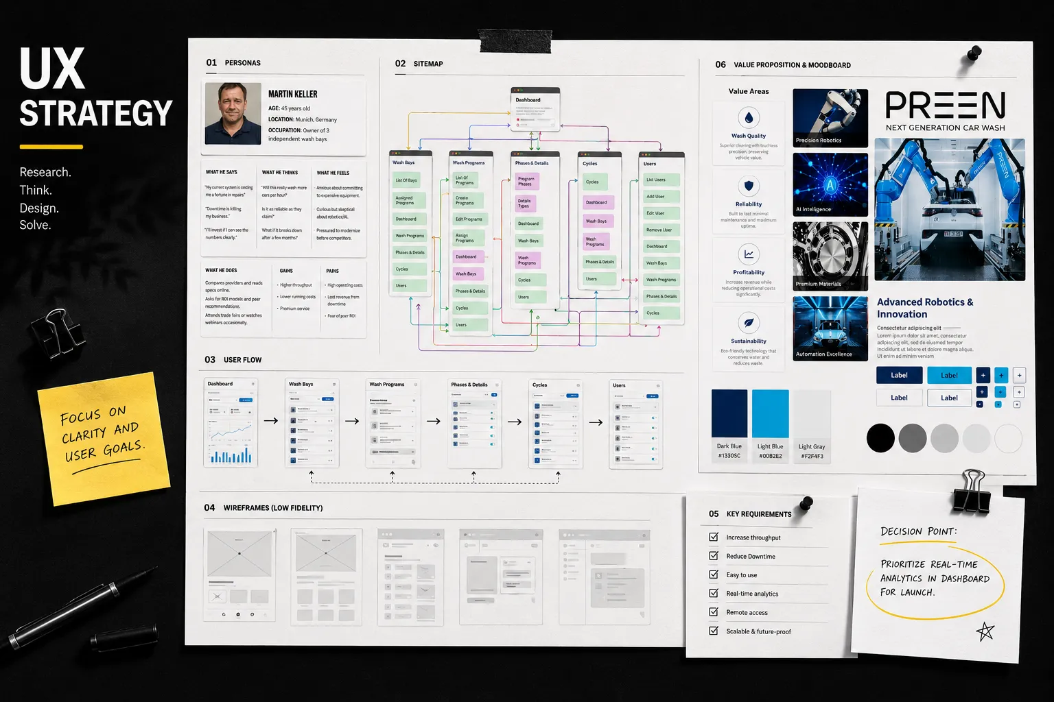
I didn’t open Figma first. Before a single pixel, I laid the strategic foundations:
- A market study to understand the sector and competition.
- Precise definition of the needs and goals of the site with the teams.
- Personas to embody the different client profiles.
- A tone and message strategy, to give the brand a coherent voice.
- A CTA strategy designed to guide the visitor to action.
- A clear sitemap, then wireframes.
And throughout, careful documentation to communicate with the teams and secure validations at each step.
On a technical project with many stakeholders, documentation wasn’t a luxury — it was the common language that let everyone move in the same direction.
The result
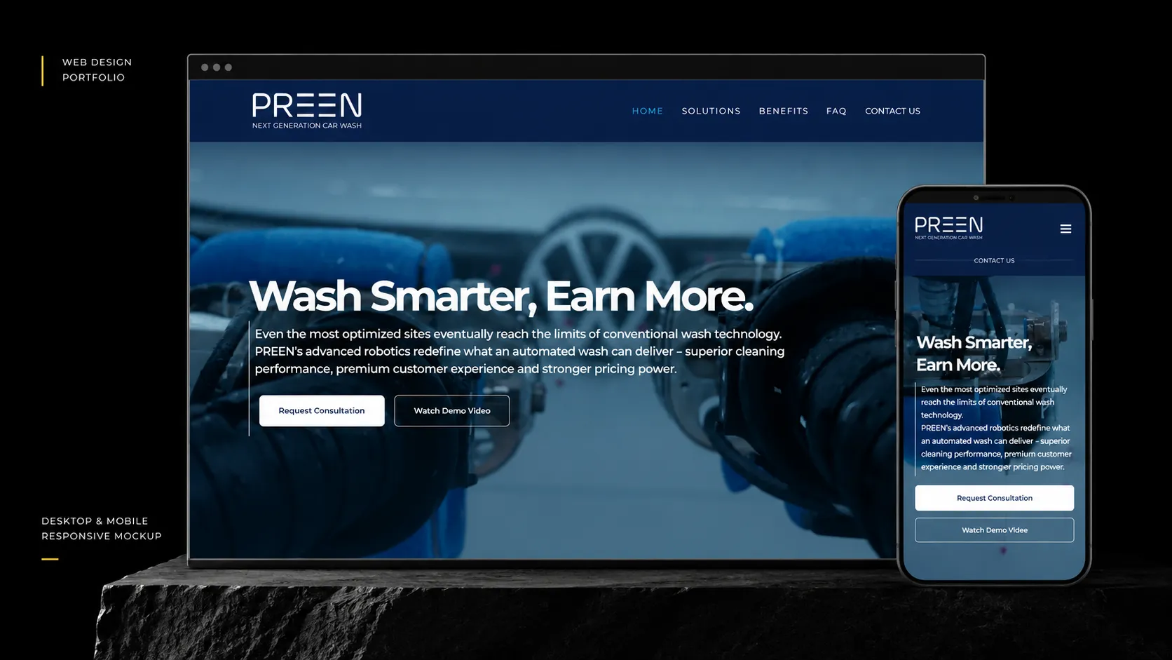
From this strategy was born a site I then built on WordPress — making a breakthrough technology clear and desirable.
03 Part II
The three applications
Three users, three radically different logics — and a single system that had to stay coherent.
The challenge
Three applications. Three users with radically different logics. A single system that had to stay coherent.
On one side an end customer who just wants to wash their car without thinking. On the other professionals piloting installations, monitoring performance, managing teams. And a red thread through it all: role management — who can see what, who can edit what.
Foundations
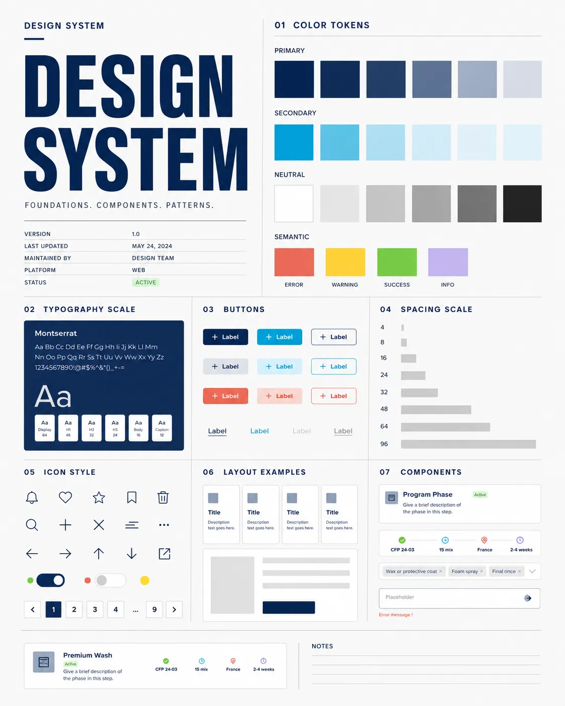
The design system, the backbone
As with my other complex projects, I started by creating a design system on Figma to reuse components easily and ease the developers’ work.
On three applications run in parallel, that’s what guarantees visual coherence and saves precious time for everyone.
01 Application
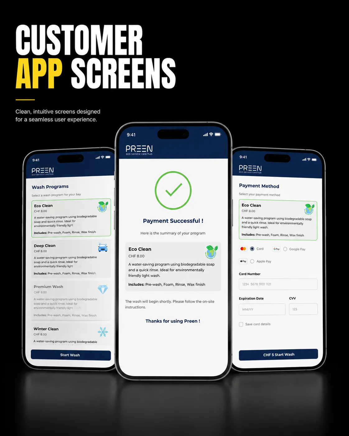
Customer side — the absolute simplicity
The most consumer-facing of the three: allow the user to choose a program for their car wash.
Here, everything had to be immediate, obvious, frictionless. Simplicity as the goal.
02 Application
Operator side — the pilot station
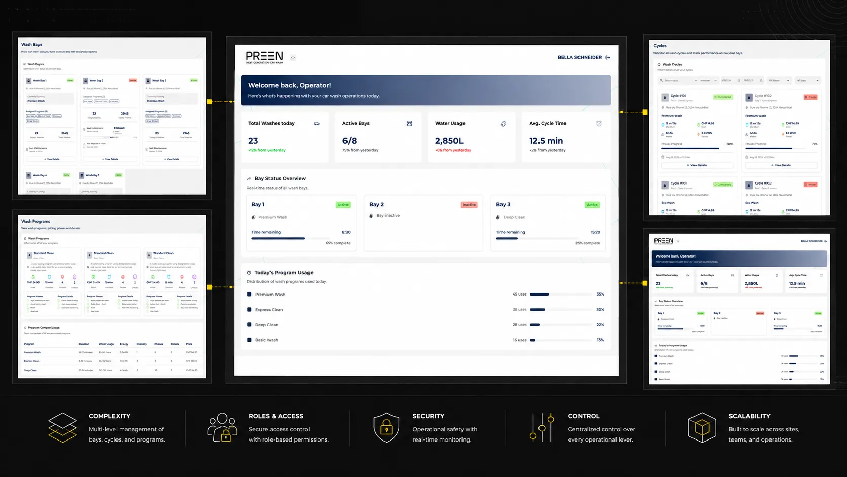
The complexity piece. This application is a true pilot station, with a main dashboard gathering installations, programs and wash statistics.
Around it, a series of specialized pages: wash spaces (description, assigned programs, maintenance, number of washes), programs (price, products used, phases), phase details, cycle monitoring to track performance, team member management, and parameters.
And above all, a role logic: the same interface behaved differently depending on the user. The operator could view everything without editing; the owner could edit certain information. Designing this double permission level while keeping a fluid and legible experience was the real design challenge of this application.
03 Application
Admin side — the control tower
Finally, the company’s internal application: the control tower allowing them to manage all clients, also structured across several pages depending on supervision needs.
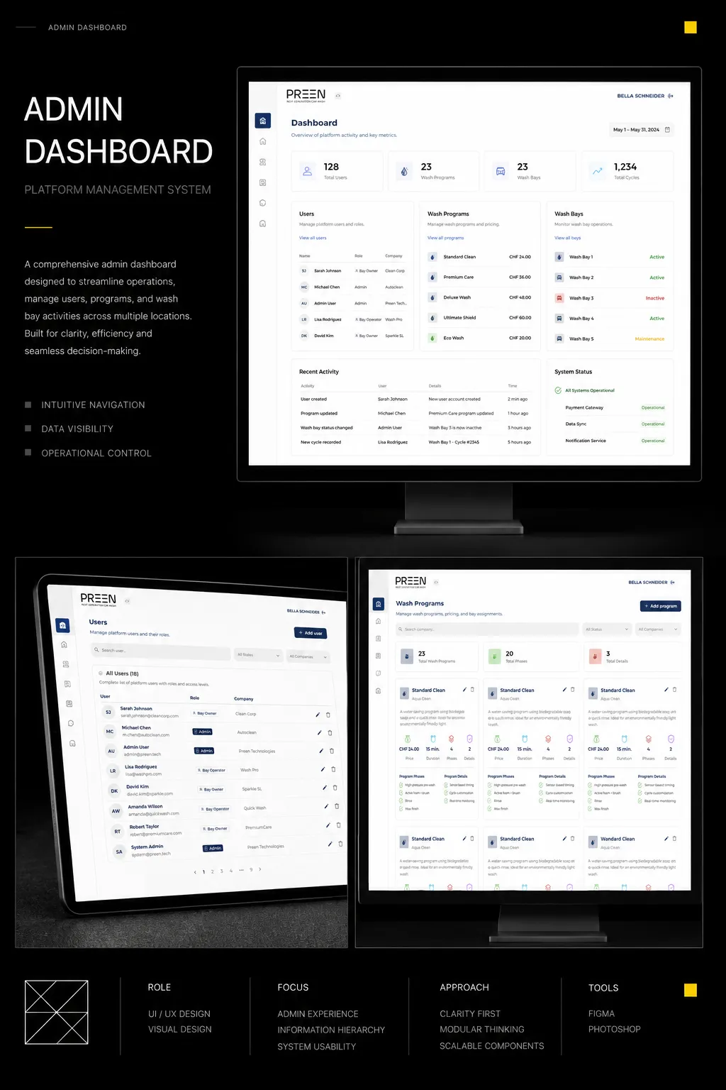
The real tour de force wasn’t to design beautiful screens — it was to make three so different applications resemble each other, understand each other, and work as a single family.
04 Takeaways
What this project taught me
I delivered a complete and coherent digital ecosystem, from the site that sells the technology to the tools that run it day to day. A rare-scope project, on a high-end product — and the satisfaction of seeing this technology continue its expansion today well beyond Switzerland.
This project taught me to design for complexity without suffering it: structuring mountains of data, managing roles and permissions, designing for users with opposite needs — while keeping overall coherence.
It also confirmed one thing: on a technical product, the designer isn’t there to “make it pretty”, but to make intelligible what isn’t. Transform complexity into clarity. That’s probably the skill I’m most proud of.
Let’s work together
The next project might be yours.
luciebelleudy@outlook.com