2026 UX/UI · Wix
Clara Yoga
Creating from zero the identity and site of an independent yoga teacher — from logo to booking system.
Bringing to life an overflowing vision into a clear brand and a connected site, including an integrated booking and payment system.
01 The context
Start from nothing — except the raw material
Clara is an independent yoga teacher in Lausanne. When we started, there was nothing: no site, no visual identity, no logo. Just a talented practitioner, the need for a professional presence, and the wish to centralize and automate her bookings — which until then were managed by hand.
And one other thing, in abundance: ideas. Clara knew what she wanted to convey, she had a vision — but everything was still mixed up. My mission: create everything, and above all, put order into this vision.
02 The challenge
Translate a vision into clarity
The real challenge of this project wasn't technical. It was translation.
The listening work
Clara overflowed with ideas about her approach, her universe, what she wanted to say to her future students. But an overflowing vision isn’t yet a brand or a site: it’s raw material that needs to be heard, sorted, structured.
My role was to transform this stream of intuitions into something coherent, legible, and faithful to who she is.
A structured and embodied yoga, nourished by traditional practice and neuroscience, explained with clear pedagogy — far from esoteric jargon.
The compass
The pivot point was our brainstorming session. Digging together, we co-constructed this positioning that would orient everything. Once this thread was found, every design decision had a compass.
03 Research & UX
Decorating in the void is drawing for no one
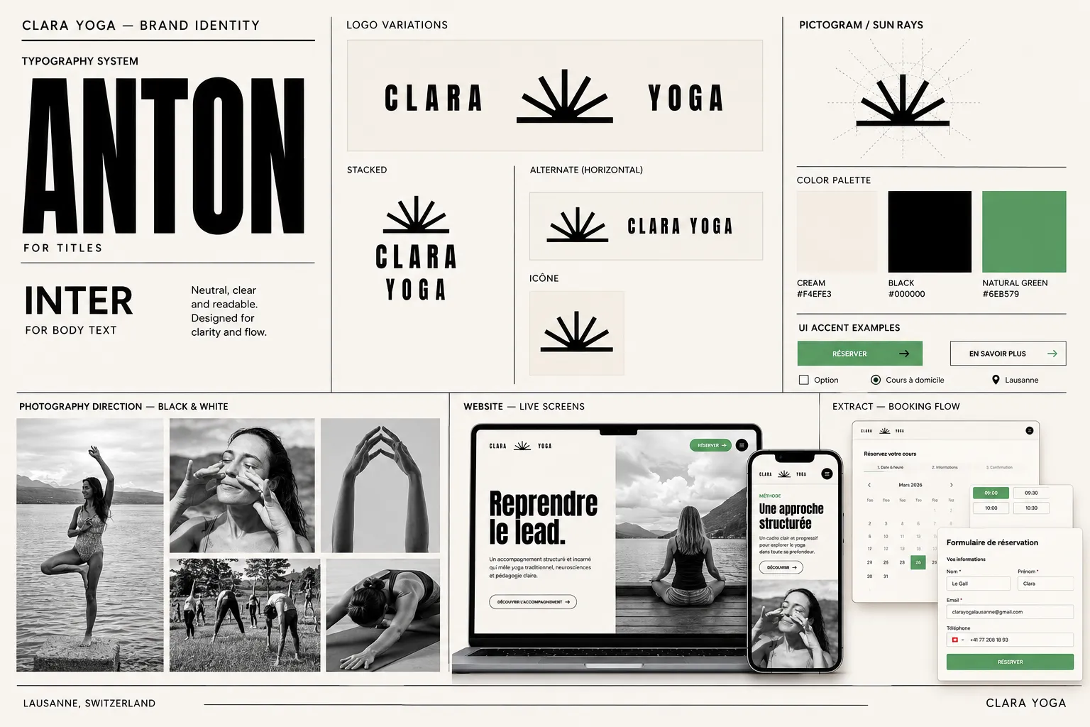
Personas, market study, empathy map, sitemap. Not to check boxes — to understand.
The user insight
Clara’s target — often stressed people, in life transitions, or simply curious about yoga but a bit intimidated — could be put off by two opposite pitfalls:
- On one side, the spiritual jargon that excludes.
- On the other, the information overload that discourages.
The two decisions
From this finding flowed two concrete design decisions:
- A clear, accessible tone — no dogma, no mysticism. A voice that explains, reassures, makes you want to join, aligned with Clara’s pedagogical approach.
- An architecture that breathes — rather than piling all the richness of her approach onto one page, I intelligently distributed the content across several pages. Each thing in its place, without ever overwhelming the visitor.
04 The identity
Carte blanche, and a playground
Trust as a gift
For the identity, Clara gave me something precious: trust. She had ideas, but gave me carte blanche from the start.
And that’s where the project became a real playground — I could explore, test combinations, look for the right associations without constraint, until finding the right balance.
Translating words into visuals
My work consisted in translating her words into visual choices. When she described how she imagined her universe, I listened as much to the content as to the feeling, and I transformed that into concrete decisions.
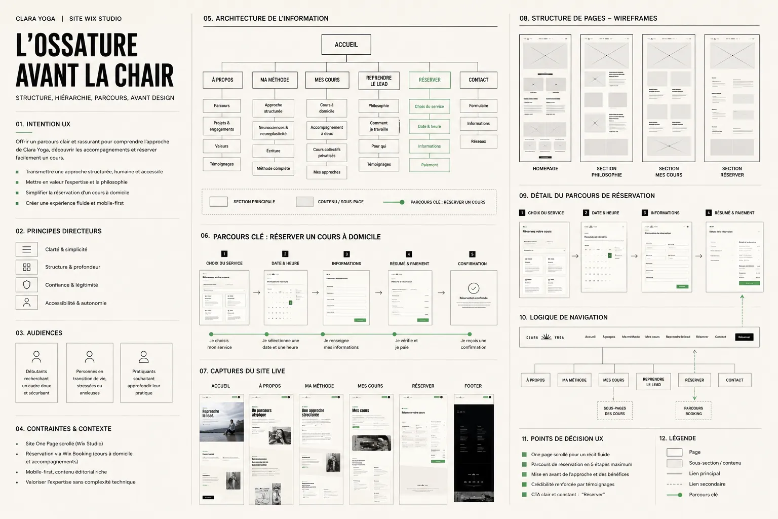
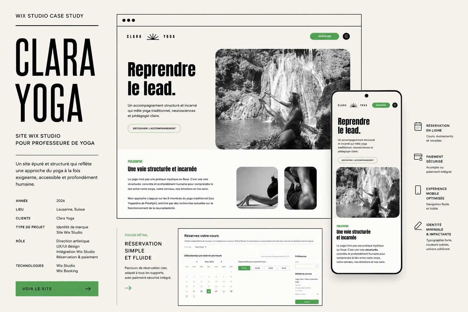
The result: a clean “CLARA / YOGA” logo, sober and grounded typography, a natural and minimal palette. An identity that says clarity and grounding rather than the wellness cliché — coherent, down to the smallest detail, with the positioning we’d defined.
05 Integration
From wireframe to living site
Once the structure was validated in wireframes, on to design then complete integration on Wix Studio. That’s the step where the skeleton takes flesh: typography, images, spacing, the rhythm of the pages.
Putting the initial wireframe and the final screen side by side is seeing an intention become an experience.
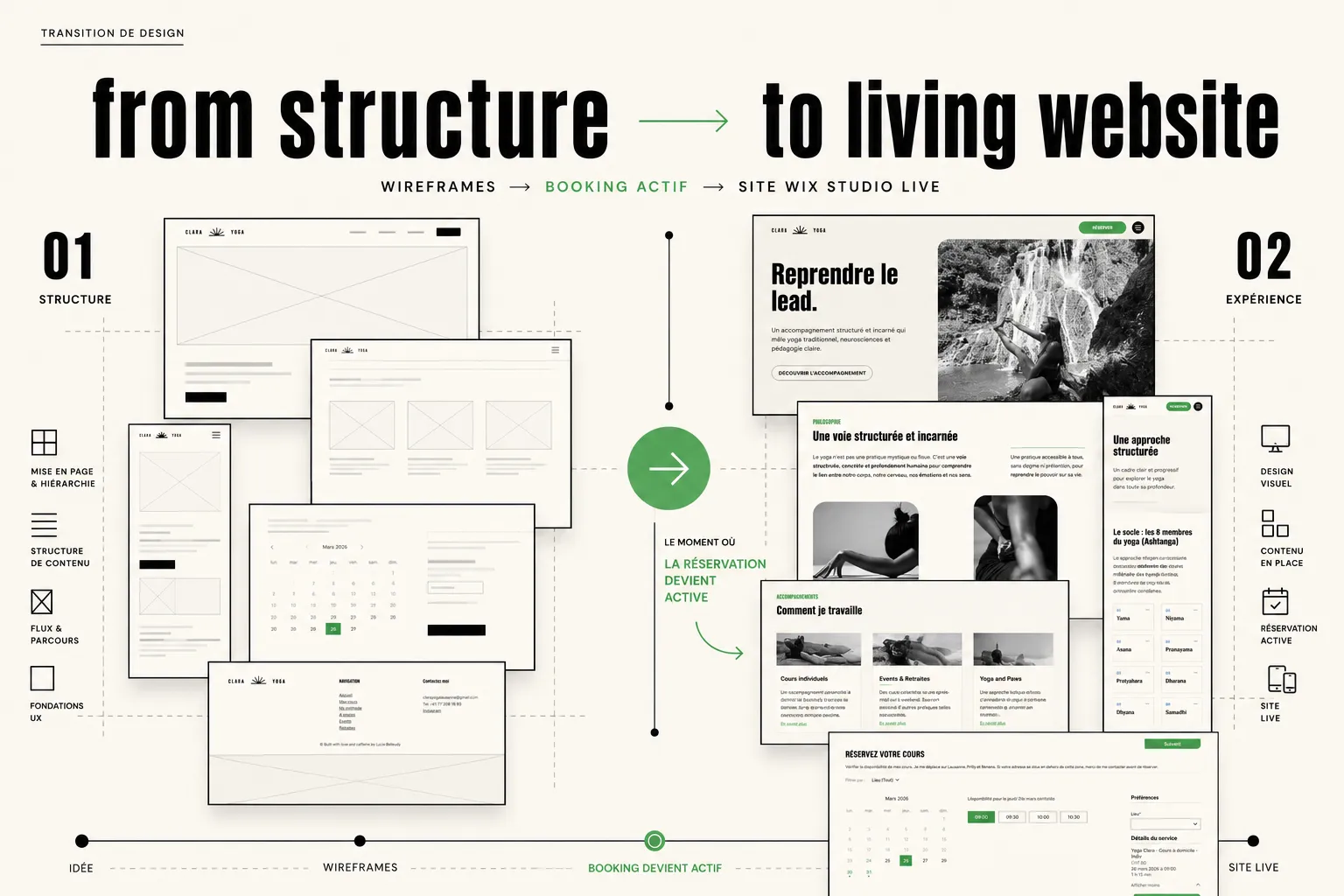
From wireframe to living site — scrolling the final result.
The technical challenge
Booking & integrated payment
The central stake of the project was automation: allow Clara to centralize her bookings and collect payments directly from the site, without manual management.
Small detail: it was the first time I was setting up a system like this. So I learned along the way, picking up what was needed when it was needed. Rather than backing away from the unknown, I took it as it came — and I delivered a complete, functional and autonomous booking and payment system.
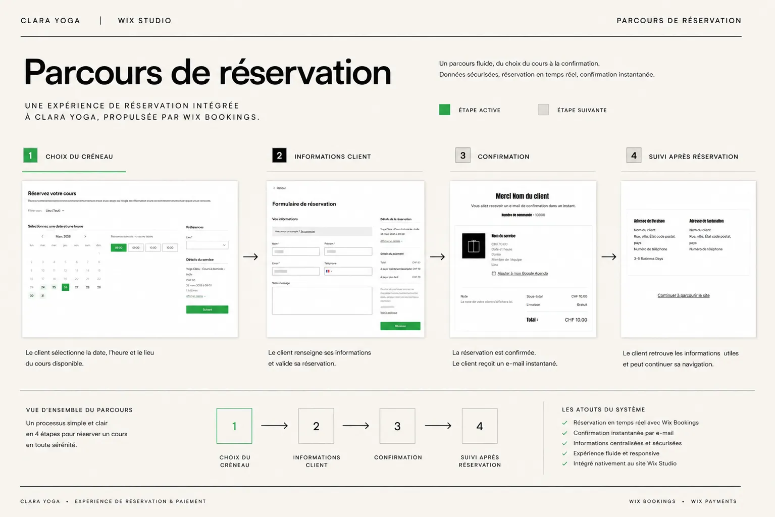
Turning an “I don’t know how to do that yet” into “it’s online and it works”.
06 Outcome
The best feedback
When the work we deliver becomes a source of pride for the person who carries it, we've won.
Results
The site is online, and it does its job. Clara finally has a professional presence worthy of her practice, and a system that saves her time daily.
The best feedback? Clara is thrilled with the result — and her own clients compliment her on the site.
Après deux sessions d’1h, elle avait déjà tout saisi : ma vision, mes offres, mon public cible. Je ne m’attendais pas à un tel travail et surtout un tel résultat.
Translated fromFrançaisAfter two one-hour sessions, she had already grasped everything: my vision, my offers, my audience. I wasn’t expecting such work — and above all, such a result.

07 Learnings
Listen and translate
Clara Yoga is the project that confirmed for me that my craft isn’t only about drawing: it’s also about listening and translating. Take an overflowing, a bit fuzzy vision, and make it clear, beautiful and functional — maybe that’s the heart of design.
It also taught me that a client’s trust is a gift to give back: it’s because Clara gave me carte blanche that I could offer her better than she imagined. And that not knowing how to do something is never a reason to say no — just an occasion to learn.
Let’s work together
The next project might be yours.
luciebelleudy@outlook.com