2023–2025 UX/UI · Dev
POS System
The complete redesign of a three-app ecosystem for restaurants. Started from zero — literally.
Transforming a functional but unappealing product into a coherent, desirable, efficient ecosystem for three types of users with radically different needs.
01 The context
First designer of a product that never had one
BonApp is a Lausanne startup (MGMT family office) that builds a POS solution for restaurants. When I arrived, the product already existed, worked, and had real customers. With one detail: no one had ever done UX/UI work on it. Not a mockup, not a research, nothing on Figma.
The product ran on the sheer force of its business logic — and got along just fine without any consideration for the user. That’s where I enter, as the team’s first designer.
02 Part I
The starting point
Let's be honest: it worked, but it wasn't designed for the people using it.
State of play
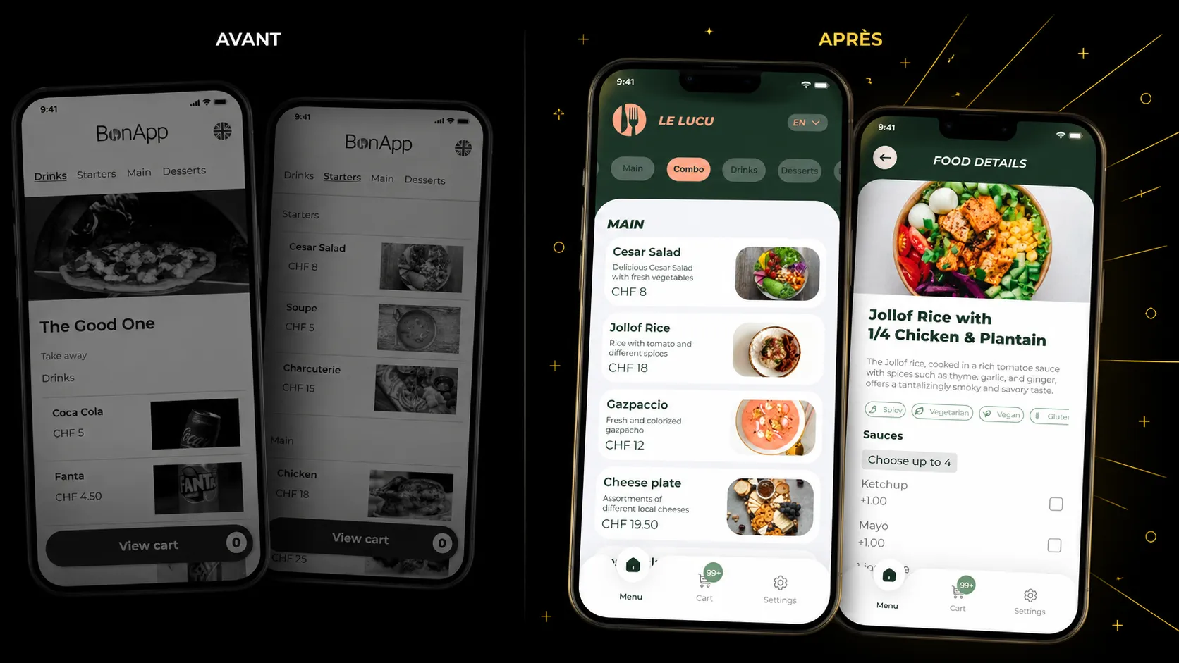
Unengaging interface, inconsistent screen to screen, and a usage logic that asked the user to adapt to the machine rather than the other way around. For a product meant to be handled at high speed during service, or by a customer in a rush to pay, it was a real barrier to adoption.
I keep these screenshots preciously. Not out of nostalgia, but because they tell half the story: a redesign is only measured against its starting point.
The challenge
How to turn a product that works but no one wants to touch into a coherent, desirable, efficient ecosystem — for three users with radically different needs?
The customer, who wants to order and pay on their phone without thinking. The waiter, who has no three seconds to lose in the middle of service. The manager, who runs their restaurant and wants to control everything at a glance. Three worlds, three logics, a single system that had to hold them together — on a living, production product where new features kept landing.
03 Part II
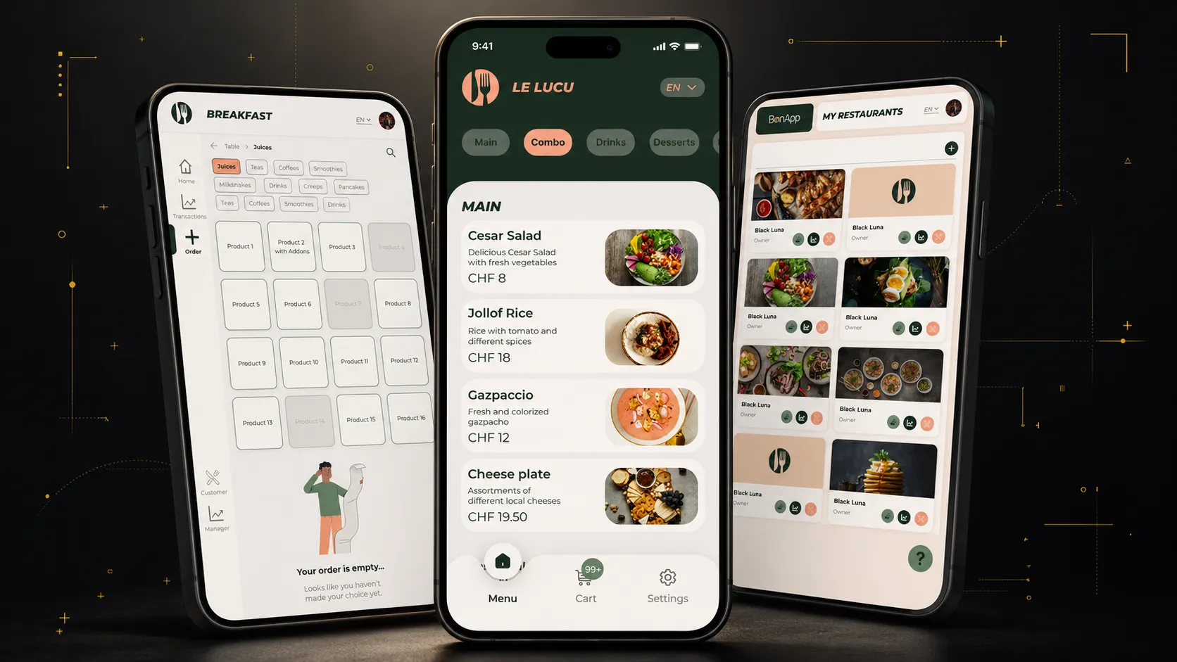
Three apps, three crafts
Three users with opposite logics — a single system that had to hold them together.
01 Application
Customer — obviousness as the goal
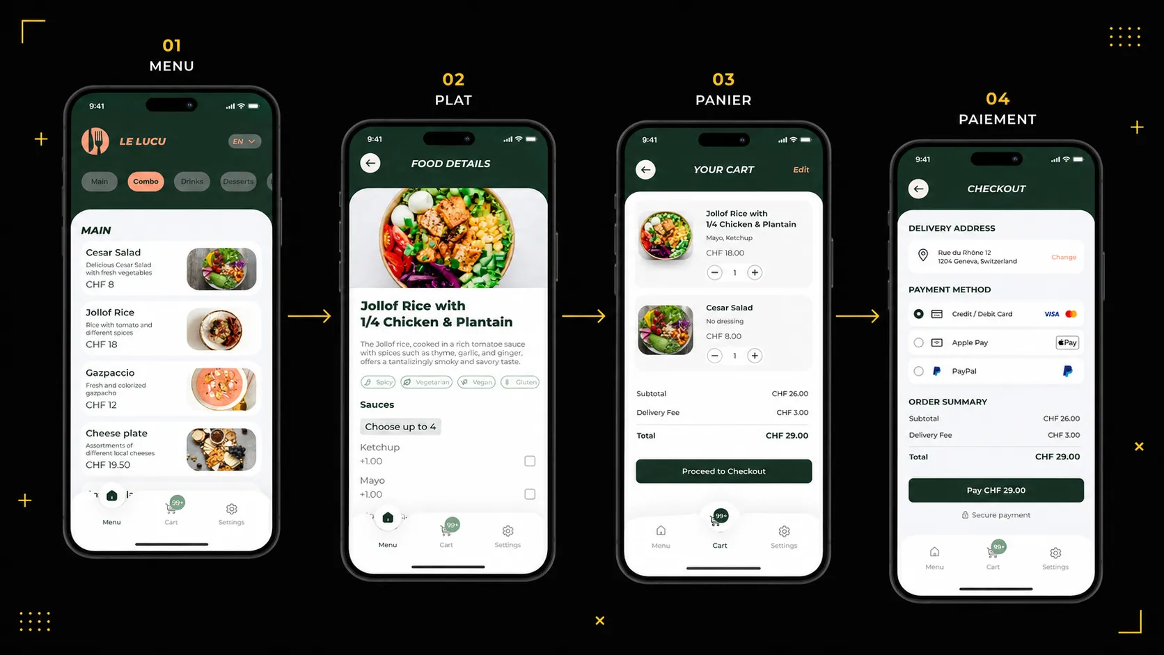
Order and pay on mobile, without friction, without tutorial. The target is everyone: from digital native to the customer discovering you can pay your coffee with a QR code.
The challenge was to make the journey so obvious it doesn’t get noticed.
02 Application
Waiter — speed as the constraint
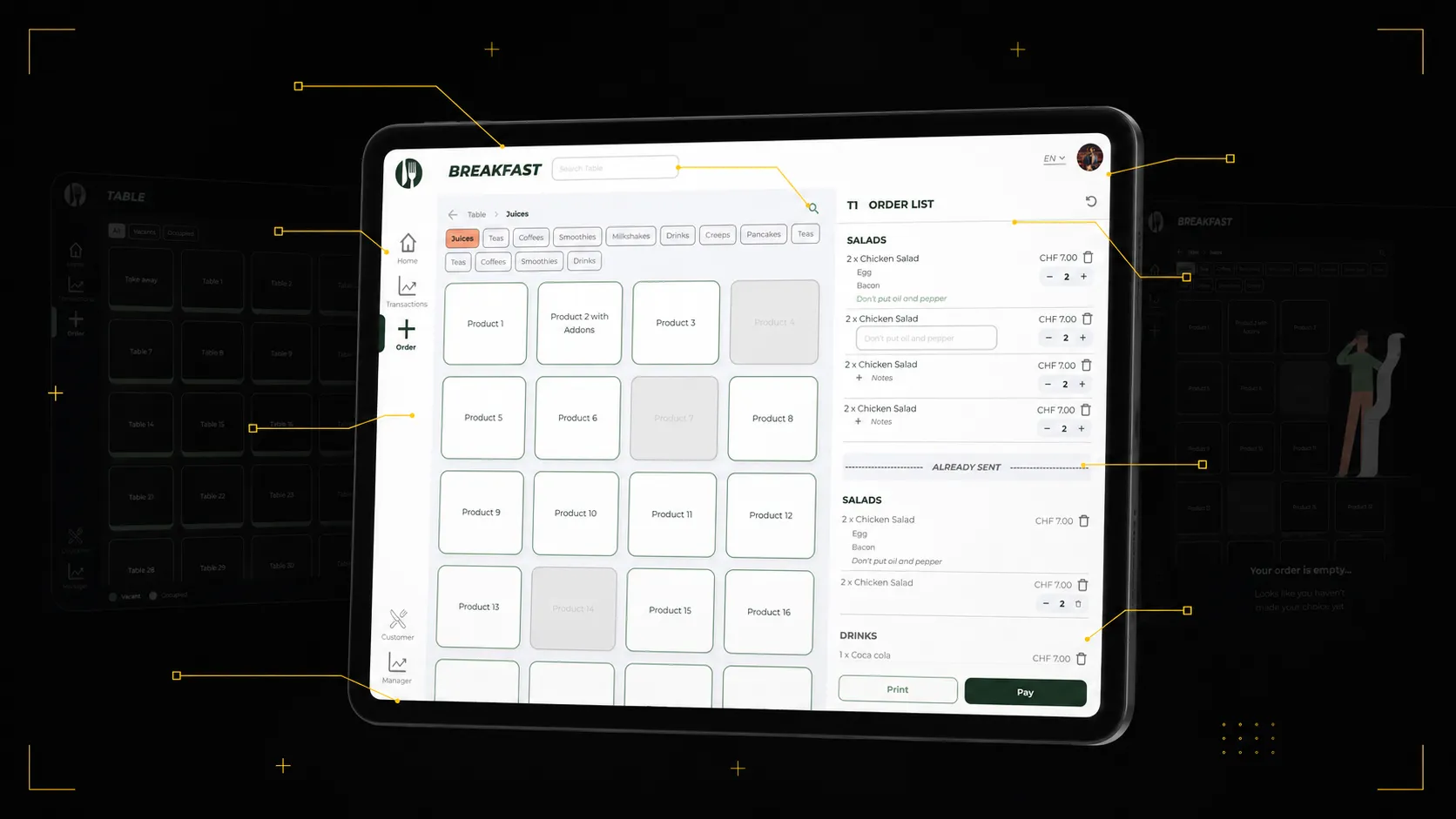
This one didn’t exist. The idea: allow the restaurant to centralize everything on the same system, without depending on whether the customer uses their mobile or not. I participated in defining the features and requirements.
Concretely, the waiter can select tables, navigate available menus, place orders, take payment, print tickets and access transactions. All designed for speed: in the middle of service, every tap counts.
03 Application
Manager — the pilot station
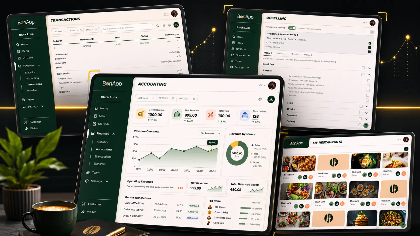
Hours, menu, prices, QR codes, statistics, transactions, team management. Where the restaurant owner takes back the reins of their place.
The challenge: make a considerable amount of parameters legible, without turning the screen into an airplane cockpit.
04 Part III
The key decisions
Two moments where the project pivoted — creating a design system, then the Waiter app designed from zero.
01 Key decision
Create the design system
After a few weeks, a realization: I was spending huge amounts of time redesigning components I had already drawn elsewhere. With every new screen, we started a little from scratch.
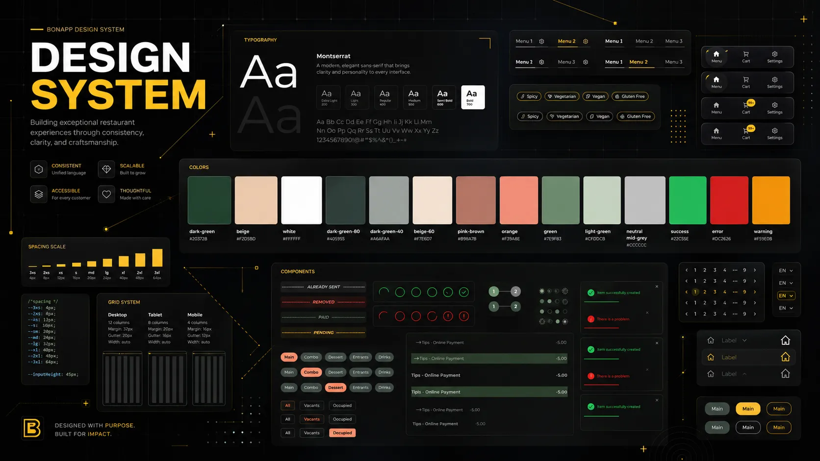
So I took the initiative to create a complete design system on Figma. Not out of love for methodology, but because it was the only way to hold three coherent apps in permanent evolution.
The impact didn’t wait: real coherence between the three applications, much faster onboarding for new people, fewer design errors, and notably smoother collaboration with developers.
02 Key decision
Design the Waiter app
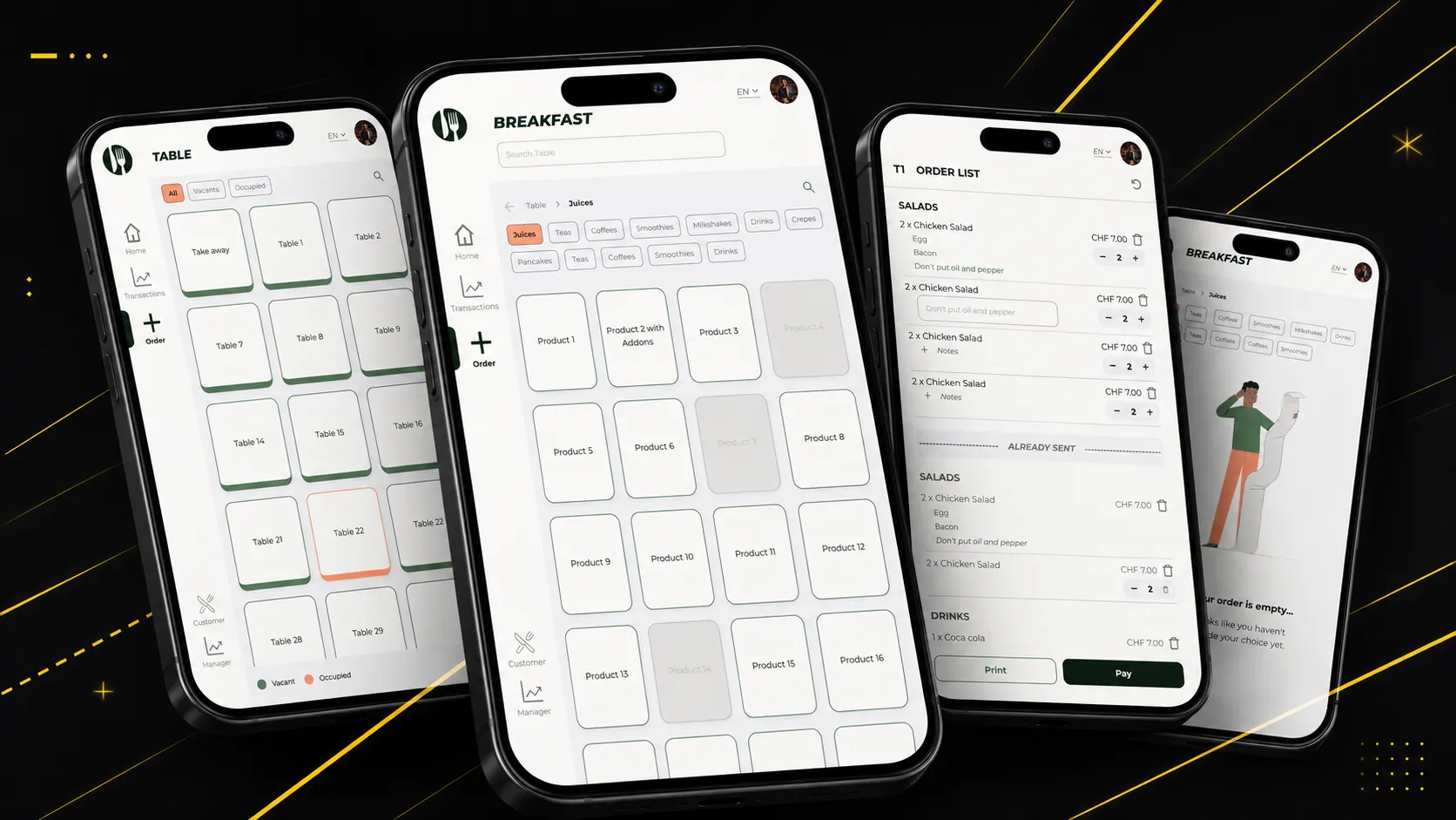
The Waiter app is my blank-page playground. Nothing existed, everything had to be invented — and it’s probably the project whose stakes were the most operational.
The central challenge: design a tool usable in the middle of service rush. A waiter taking an order has no time to search, to think about navigation, or to fix a manipulation error. The interface had to disappear in favor of the gesture.
I worked the feature definition with the team starting from real service constraints: speed of selection, immediate legibility, payment journey without detour.
The design / code bridge
Hands in the code
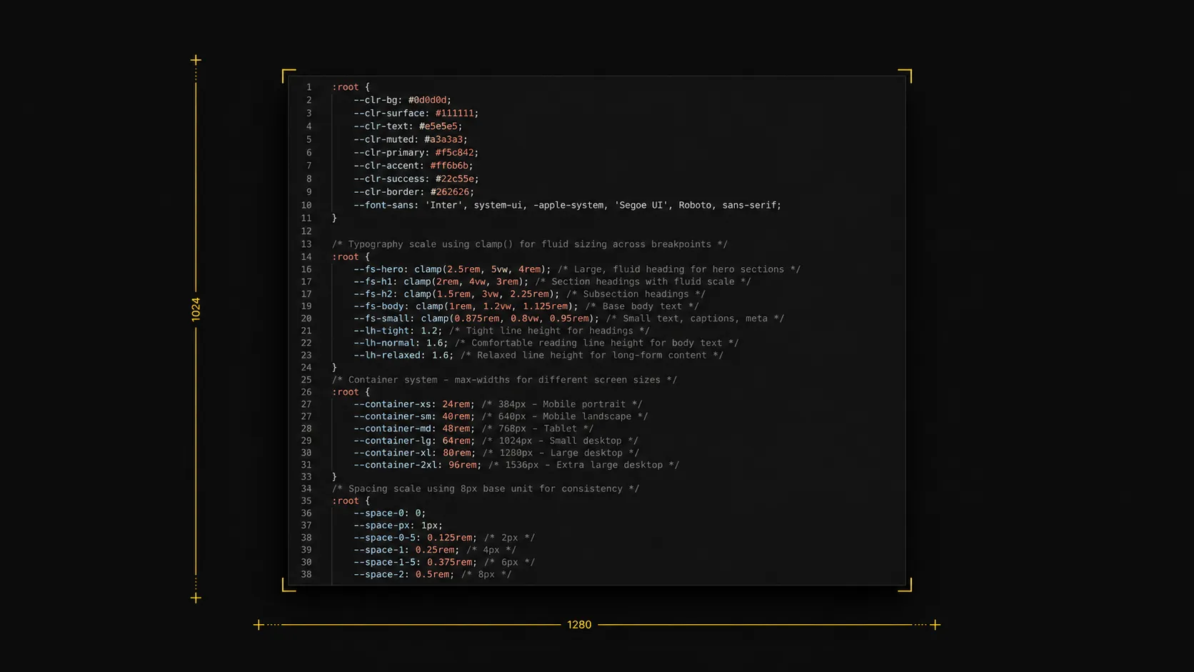
Here’s the part I didn’t expect to love so much: I put my hands in the code, mostly CSS, in React.
First for a simple reason — with a designer’s eye, the final result was immediately more faithful to the intent. The details that make an interface “right” often play out at a few pixels, and those pixels were better off if I tuned them myself.
But the real gift was elsewhere: touching the code helped me understand the technical constraints from the inside. I learned to design not in the abstract, but in light of the real means we had to make things. An unbuildable design is a nice drawing, not a solution.
Not the one who draws and throws her mockups over the wall hoping for the best, but the one who follows the product through to the final pixel.
05 Outcome
The result on the floor
Adoption, satisfaction, structure: a product that grew important enough to build a team around it.
Results
The product was adopted by restaurants, customers were satisfied, and we observed a reduction in user-side errors. We had a long way to come — that’s precisely what makes the result satisfying.
And a signal that says a lot: for a year and a half, I was the only designer. Then the team grew by one person, and I officially became Head of Design. The work had grown important enough to structure a team around it.
06 Learnings
What this project taught me
This project taught me to design for a living product — one that changes, grows, and doesn’t wait for design to be “perfect” to move forward. It taught me that the best designs are born at the intersection of the desirable and the buildable, and that understanding the code takes nothing away from creativity: it makes it operational.
And it took me from designer to Head of Design, that is, from “I draw screens” to “I think a system and lead a team”.
Not bad, for a product that didn’t even have a Figma file when I arrived.
Let’s work together
The next project might be yours.
luciebelleudy@outlook.com