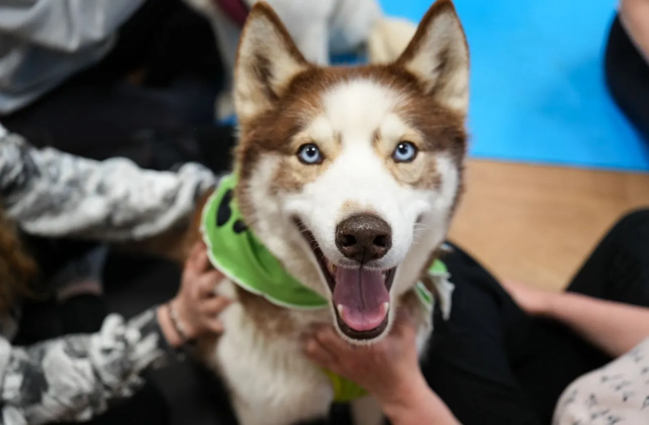
2026
Yoga & Paws
Repositioning a yoga association with shelter animals: from cute activity to emotional brand.
Shifting the brand from cute activities to an emotional experience — without falling into no-frills wellness or corny Internet.
01 The context
A cause that changes how you invest
Yoga & Paws is a Lausanne association created in 2024 by Lorraine, with a simple and beautiful mission: give visibility to animal shelters while supporting human well-being, through yoga sessions in the company of shelter animals. Partner shelters are present at every session and paid for their work — the animal isn’t an accessory, it’s the heart of the approach.
I work on art direction and all the digital communication of the project. And let’s be frank: it’s a project that moves me. I’m not just designing a brand image, I’m defending a project I believe in.
02 The challenge
Too cute to be taken seriously
The insight that oriented everything: yoga isn't the subject. Yoga is the vehicle.
The finding
The communication gave the image of a friendly activity — “come do yoga with adorable animals”. Adorable, yes. But this cuteness had a cost: it trivialized the project, brought it closer to ephemeral trends like “puppy yoga”, and undermined its ethical credibility.
The exact opposite of what a serious association, that actually supports shelters, deserves.
Yoga isn’t the subject. Yoga is the vehicle. The real subject is reconnection — to the living, to calm, to the present.
The balance to hold
This shift changes everything: we no longer sell an activity, we tell an emotional experience around the living.
The most delicate balance remained: reposition the brand toward something deeper and more credible, without falling into the opposite trap — that cold, beige, corporate wellness that would have betrayed the warmth of the project. Neither too cute, nor too smooth. Just sincere.
03 Art direction
Documentary-emotional
Photograph the real — gestures rather than decor, natural light, even imperfections.
The principle
To embody this repositioning, I defined an art direction I named documentary-emotional. The idea: photograph the real. Document gestures rather than decor, catch spontaneous moments, natural light, sincere emotions — and even imperfections.
A husky yawning, an awkward embrace, a cat crossing the mat. Life, not a postcard.
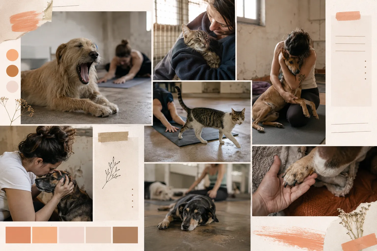
The visual pillars
A warm, earthy, sincere brand
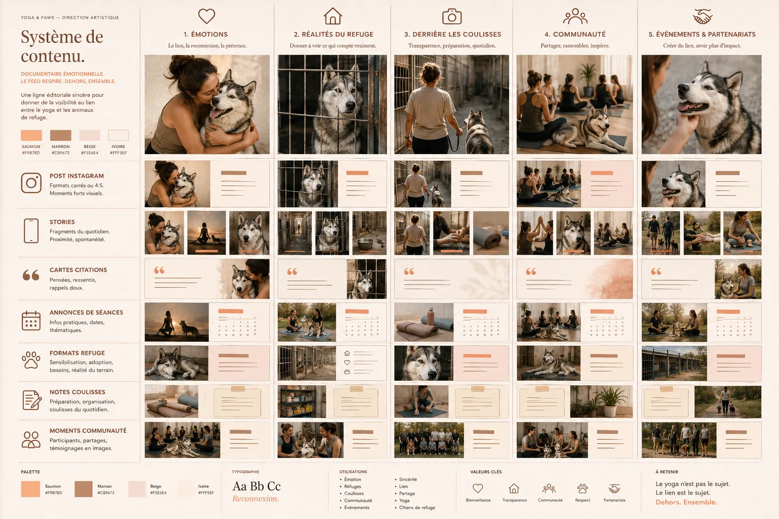
A warm and earthy palette — salmon (#F9B78D) as accent, brown (#C89673) for text, beige (#F5E6E4) for backgrounds that let it breathe. Colors that evoke warmth and skin, not antiseptic wellness.
A typography with two voices — Rekha Antiqua for titles, with its editorial and slightly literary character, set on Inter for body text for readability. Refined, not luxurious.
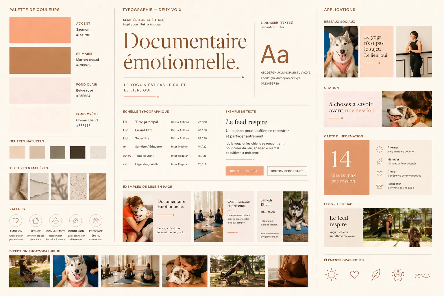
The guiding principle
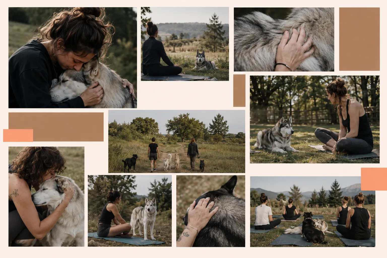
A clear guiding principle: what we look for (tight framing, gestures and gazes, natural light, visual silence) and what we strictly avoid (the “cute Internet”, beige wellness, the yoga cliché, rigid templates).
This opposition became my compass for every visual decision.
04 Content strategy
Quality before volume
Three to four hours a week, turned into an editorial stance.
The stance
Beautiful art direction is useless if it can’t hold in real life. The project has limited time — about 3-4h per week. Rather than suffering this constraint, I made it a stance: quality and coherence before volume. Two posts a week and coherent stories beat a feed that runs out.
The five pillars
Enough to feed a varied feed without losing the thread
I structured content around five pillars, each with a precise goal:
- Emotional experience — make people feel.
- Shelters and their realities — raise awareness.
- Behind the scenes — humanize.
- The community — build loyalty.
- Events & partnerships — grow the network.
The feed
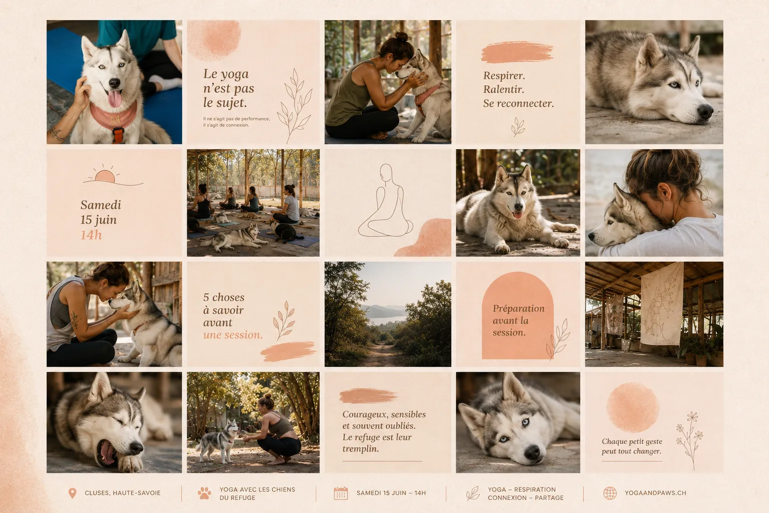
The aesthetic principle of the feed comes down to two words: it must breathe. Naturally alternate emotional photos, editorial content, human and animal moments, without a rigid grid or overload.
I created coherent templates (quotes, session announcements, shelter formats, behind-the-scenes stories) so each publication is immediately recognizable, while keeping flexibility.
05 A living project
Not delivered, not forgotten
This case study has something particular: it isn't finished. It lives.
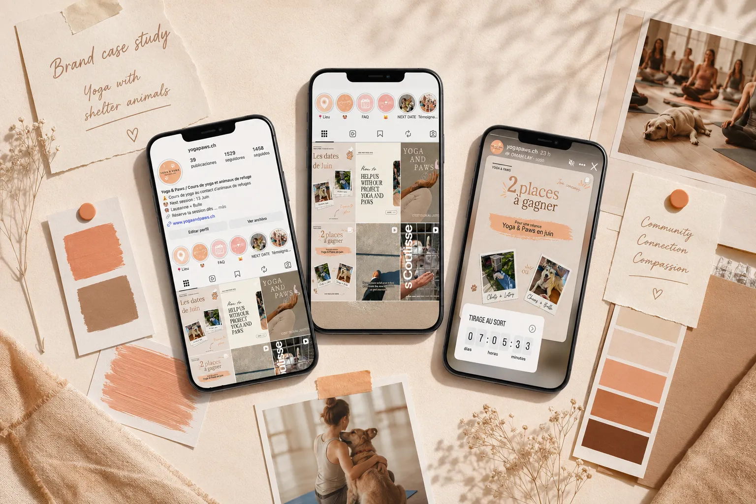
Every week, I publish posts and stories. And I’m restructuring the existing Instagram account to align it with this new art direction — migrating a presence already there toward a stronger and more coherent identity, without breaking what works.
It’s a long-haul work, progressive, that’s measured over time: building a community really attached to the project, not just a collection of followers.
The strongest brands aren’t the prettiest — they’re the ones that have something to say.
06 Takeaways
What this project teaches me
Yoga & Paws is the project where my skills and my values meet: art direction, brand strategy, day-to-day execution — in service of a cause I truly believe in.
My role wasn’t to make Yoga & Paws cute — it already was. It was to give it a voice worthy of its mission.
Let’s work together
The next project might be yours.
luciebelleudy@outlook.com