2026 UX/UI · Dev
SOS Chiens Polaires
The redesign of a sanctuary for polar dogs: from a website that informs to a website that lets you act.
Turning a static showcase site into a tool that converts Instagram emotion into donations, sponsorships and sign-ups.
01 The context
A sanctuary for life, and a website that didn't say so
On Instagram, the dogs of SOS Chiens Polaires move a lot of people. On their website, that emotion almost never found a button to turn into action: the site informed, it didn’t let you act.
In Payerne, the association takes in huskies, Greenland dogs and malamutes that no one can keep anymore. Here, a dog doesn’t leave: it stays until the end. The association lives on donations, sponsorships and its activities (dog hiking, sled rides, cuddle therapy), and runs two events, the Course des Mosses and the Canicross de Saint-Cierges.
02 Part I
The starting point
A Wix site of some fifteen pages, built up over the years, where every good intention had got lost along the way.
State of play
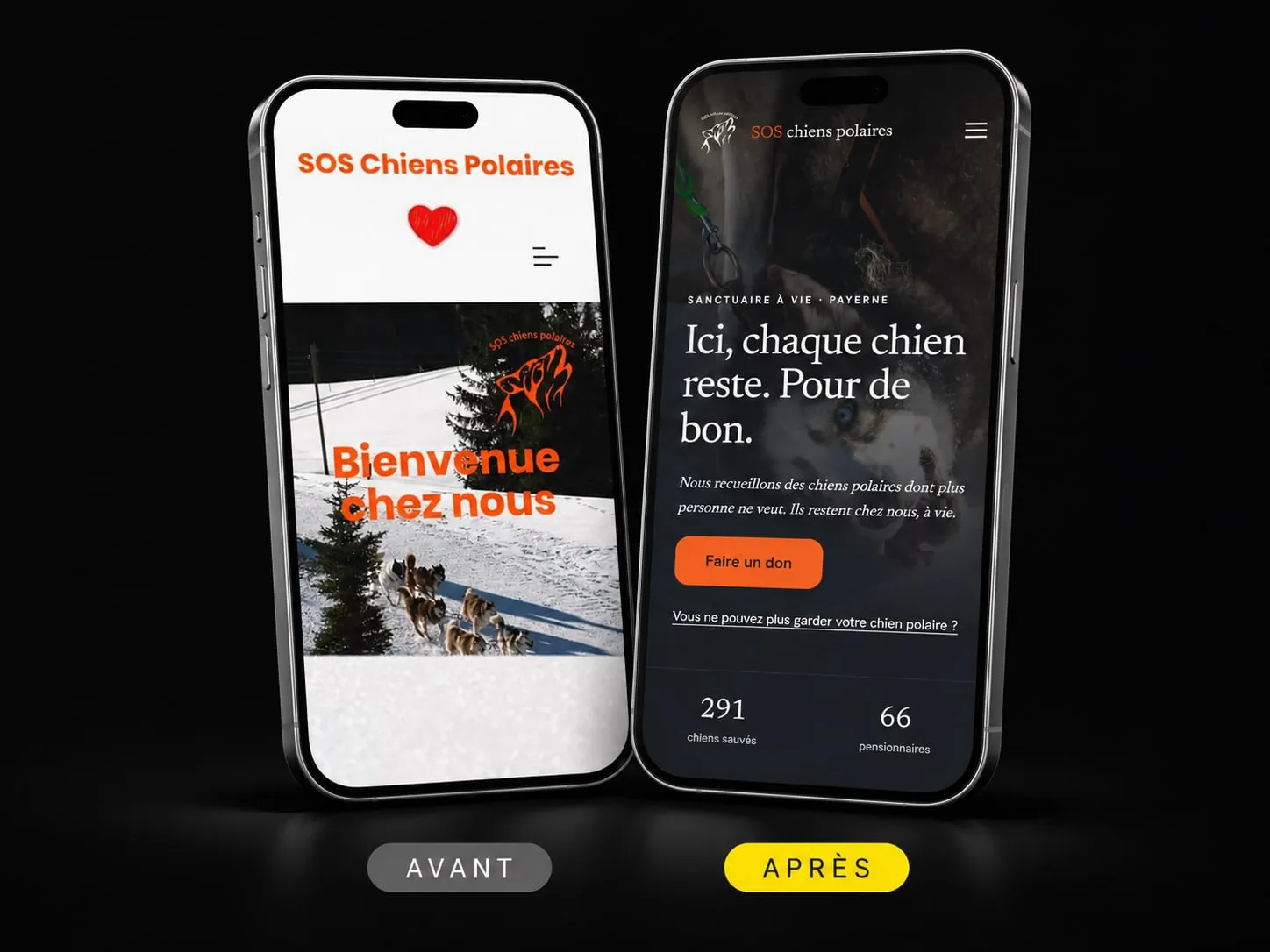
Before designing anything, I audited the site page by page and archived every screen, on desktop and on mobile. What came out of it:
- Giving was hard. The donate button came sixth, after four calls to action for the activities, and no donation could be paid on the site itself.
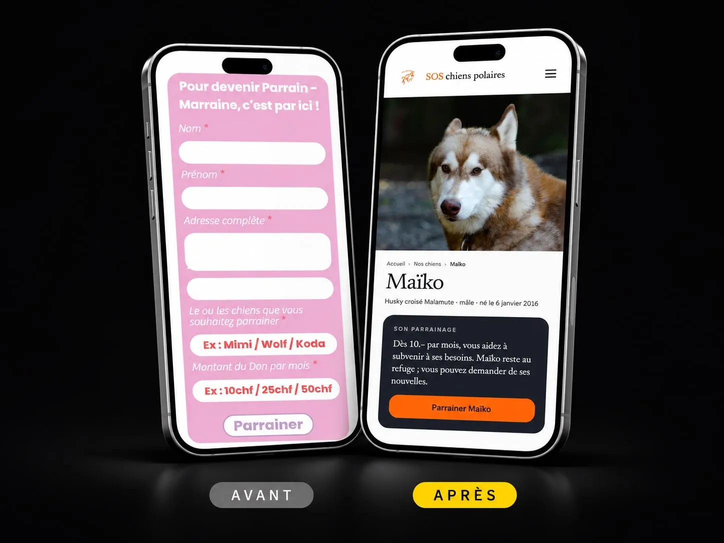
- The sponsorship form couldn’t be sent. The amount field expected an email address: there was no way to enter a sum.
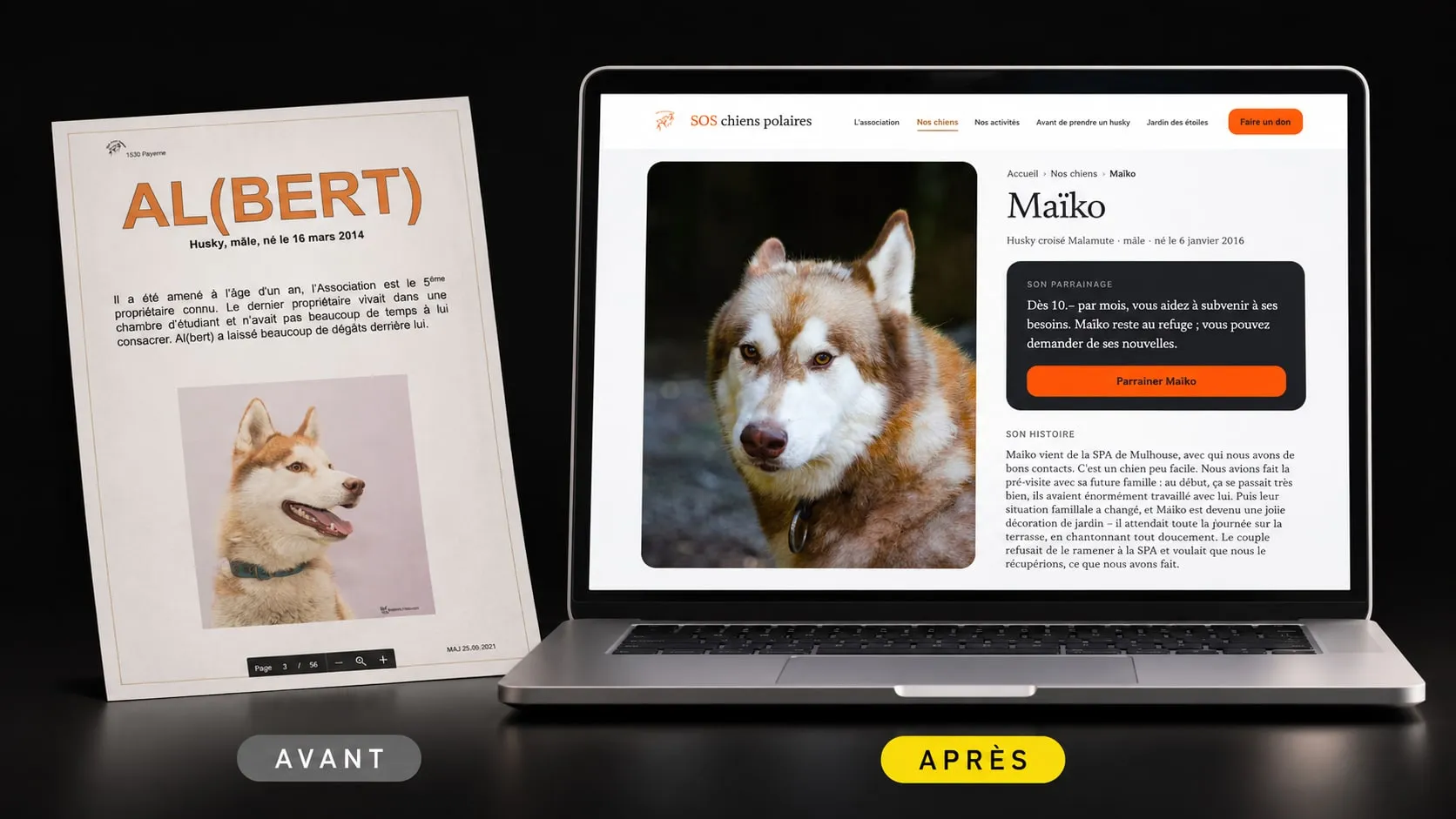
- The dogs were invisible. Their profiles were the pages of a PDF turned into images, without a single word Google or a screen reader could read, and frozen since 2021.
- Signing up for the Course des Mosses meant printing three PDFs, filling them in by hand and sending them back.
On mobile, where the whole Instagram audience lands, the gallery loaded only 20 dogs out of 59.
The challenge
How do you turn a static showcase site into a tool that converts emotion into donations, sponsorships and sign-ups, by making people want to help rather than making them feel guilty?
With one major constraint: three audiences who don’t arrive in the same frame of mind. The donor coming from Instagram, on her phone, moved by a dog. The person who has to part with their dog and is looking for help, often in urgency and shame. And the curious local, looking for something to do at the weekend.
03 Part II
The calm after the rescue
A visual stance set before the first pixel, to welcome all three audiences without rushing any of them.
Art direction
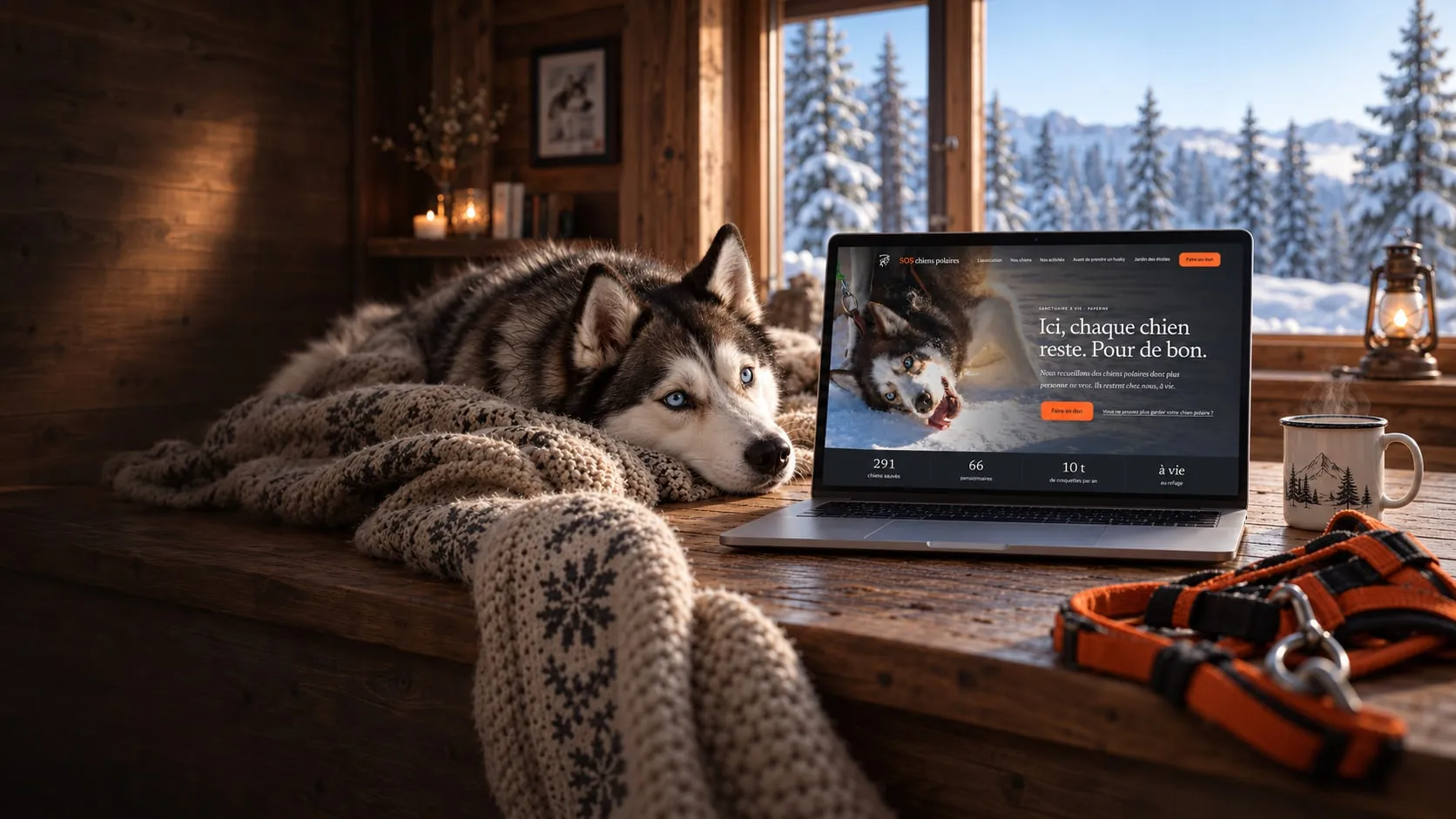
The site shows the after: a dog that is safe, at peace, dignified. Neither the thrill of a sled team racing, nor the drama of a dog in pain. The emotion it aims for is tender relief, not excitement, not guilt.
This register welcomes the donor, respects the person in distress and reframes the curious visitor: you are visiting a sanctuary, not a theme park.
Three words, “clean, warm, sincere”, became rules: one idea per screen, portraits at dog’s-eye level, dogs always named, and a single warm accent, SOS orange, kept for action.
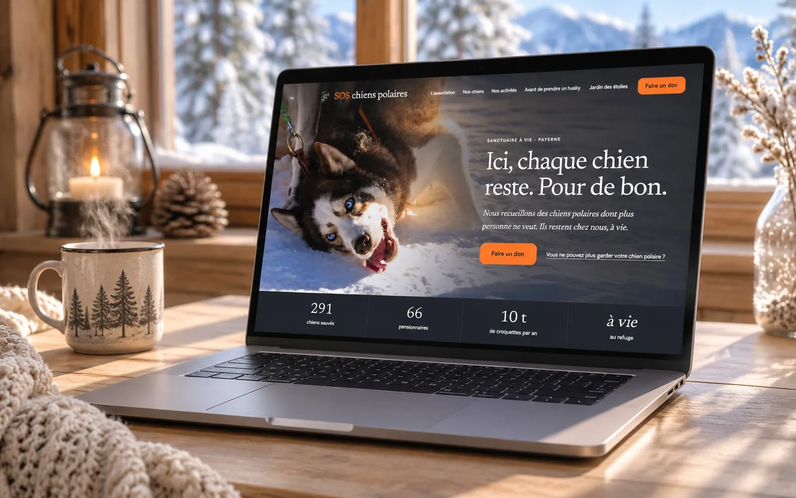
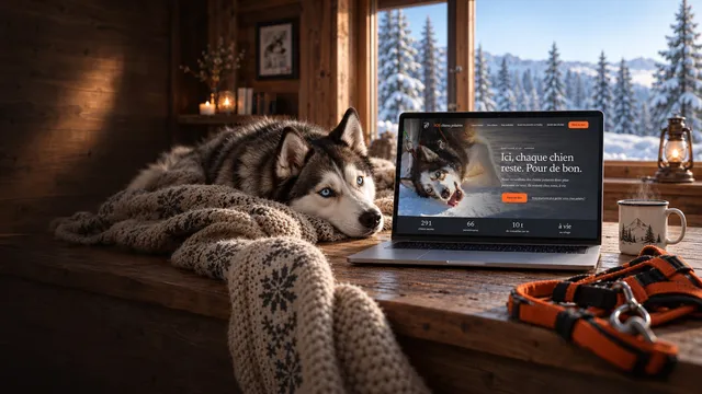
Ici, chaque chien reste. Pour de bon.
04 Part III
The key decisions
Three moments where a call had to be made, and what tipped the balance.
01 Key decision
Donation and sponsorship: two pages that answer each other
The audit revealed a paradox: the association had two monthly donations that ignored each other. Sponsoring a dog, on one side. And a recurring donation stuck at 1 franc a month on a third-party platform, on the other.
Two logics clashed. On the fundraising side, merge everything, since a regular donation counts for more than a one-off. On the search side, keep two pages, because people don’t search for “make a donation” and “sponsor a dog” with the same intent.
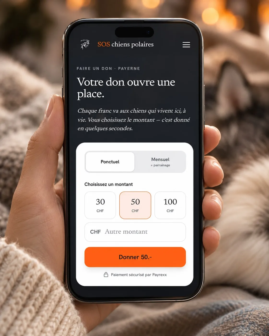
I went with two pages, with a rewritten relationship: sponsorship becomes the monthly donation, and each page presents the other second. On a dog’s profile, the “Sponsor” button opens the sponsorship page with the dog’s name already filled in. One detail of vocabulary also holds the whole project together: these dogs aren’t adopted, they stay for life. On the site, you sponsor, you never adopt.
02 Key decision
Every dog gets its own page
The PDF profiles couldn’t be corrected: they had to be rewritten. Every story was transcribed into text, and every dog got its own page, with its photos, its personality and a button to sponsor it.
It was the least visible job and the longest. It’s also the one that changes everything: a dog you can read is a dog Google can find, a screen reader can speak, and a donor can share.
The Jardin des étoiles, the page for dogs who have passed away, has its own atmosphere, more nocturnal, and no call to donate: a dog who has died can’t be sponsored.
03 Key decision
Only the truth
The high-fidelity mockup was born with Claude Design. It was beautiful, and it made things up: impact equivalences no one had ever calculated, “Swiss/EU” hosting that didn’t match reality, a fundraising gauge, and a “100% for the dogs” that was false, since the payment platform takes fees.
On the website of an association that asks for money, a false sentence costs more than an empty block. So the rule was set early: a slot without real information stays a slot, never an invention. The published equivalences come from the association itself (100 francs is 25 kg of kibble), and every claim was checked against what the association could confirm, down to the exact wording on the tax deductibility of donations.
On the “Rehome my dog” page, written for people who have to part with their animal, there is no call to donate: you don’t ask someone in distress for money.
The design / code bridge
Built to last
The site is static, generated with Astro: lightweight pages that display instantly, even on a mountain connection. The data for the dogs and the activities lives in tested modules, and every change goes through a battery of tests before it is published.
Donations and sponsorships go through Payrexx, one-off or monthly, with a Swiss QR-bill as an alternative. The five forms, including the two Course des Mosses sign-ups that replace the three PDFs, are sent through the server and land directly in the right inbox at the association.
I directed the build with Claude Code, and kept control where it matters: the stance, the trade-offs, and checking every fact before it went live.
05 Outcome
The result in the field
Launched on September 9, 2026, with the domain switched over from Wix.
Results
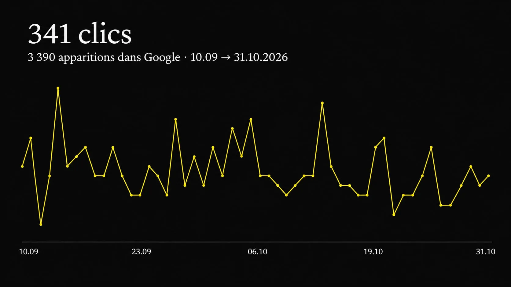
62 dog profiles now show up in Google searches, where the old site showed none. Between September 10 and October 31, the site made 3,390 appearances in search results and received 341 clicks, two out of three from a phone.
In total, 87 generated pages, including 63 dog profiles, online donations and sponsorships, and fully digital Course des Mosses sign-ups. The 29 old Wix addresses redirect to their new page: no shared link leads to an error.
On Lighthouse, the home page scores 98 for performance on mobile and 100 for accessibility, best practices and SEO; the donate page scores 100 across the board. For real visitors, the main content displays in 0.4 seconds.
Une créatrice web que je recommande vivement. Elle a fait de notre site Web une vraie carte de visite. Un design qui donne envie, une mise en page pratique et dynamique. Un service de qualité à l’écoute des clients et une réactivité qui fait la différence 😉.
06 Learnings
What this project taught me
A redesign is decided less by what you draw than by what you take stock of: tracking down every dog, every date, every real price, and making sure no sentence states a false fact.
This project also taught me that no automated test replaces checking things by hand. On launch day, 636 automated tests were passing. By retracing the shortest path to a donation, that of the donor who accepts the suggested amount and clicks, the manual check found what none of them saw: she landed on the payment page with an empty amount field.
And that a charity website doesn’t need effects to move people: it needs you to look its dogs in the eye, and to be able to help them right away.